Designed by Apple: Intention
This Apple film, "Designed by Apple: Intention," uses animated geometric shapes and minimalist text on a white background to articulate Apple's design philosophy, transitioning to a dark background for the final reveal. The creative treatment delivers the message through a visual metaphor of focus and connection amidst complexity, culminating in the Apple logo and brand message.
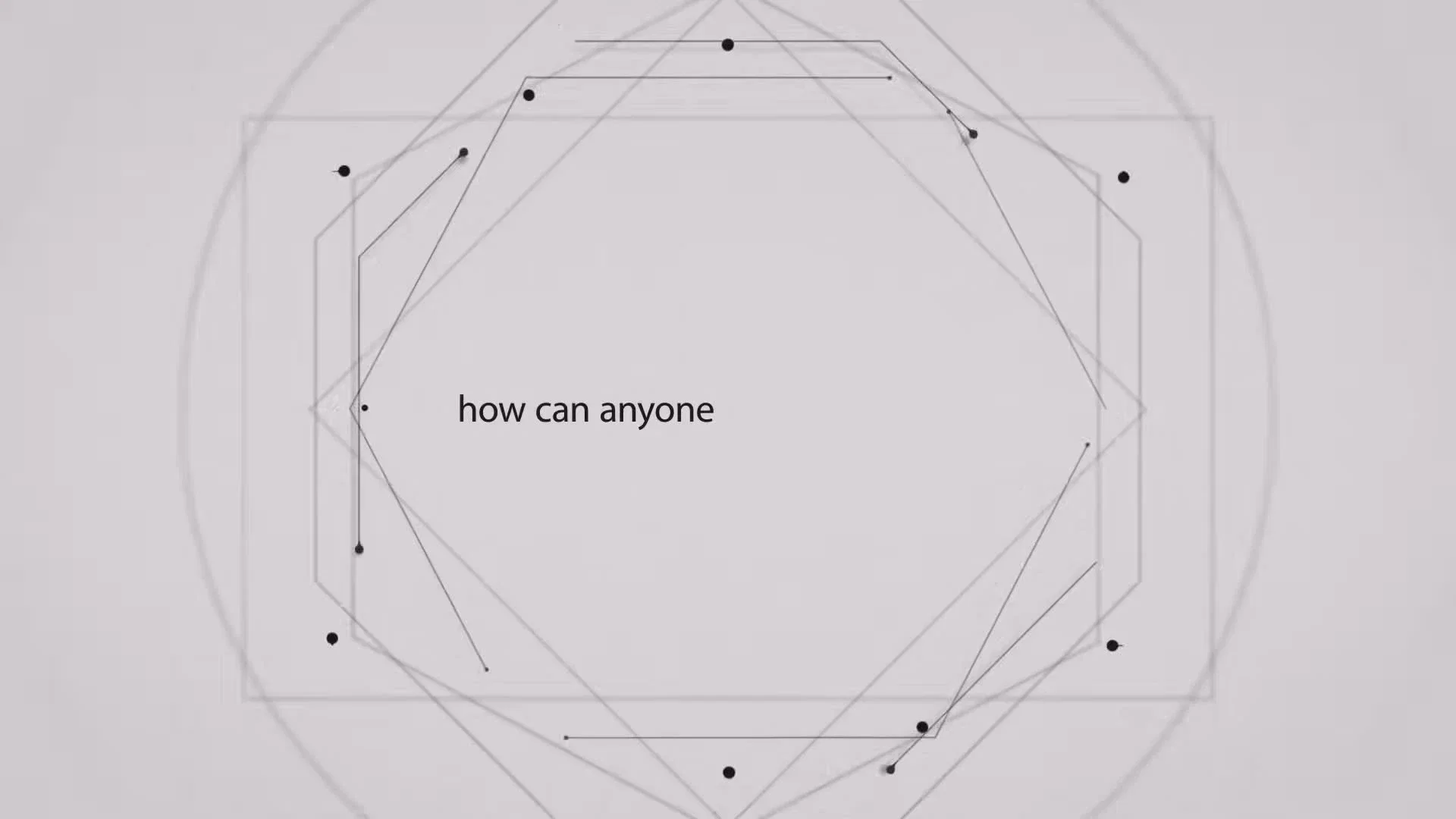

At 0:12, the screen is pale gray. A complex, evolving geometric pattern of faint lines and dots forms an octagon-like shape in the center, with lines extending outwards from some points. The black text "how can anyone" is displayed centrally, framed by the intricate lines.
This moment establishes the core problem by visually and textually posing a question about perfection amidst complexity, representing the 'noise' or 'distraction' that prevents clear focus, which is the film's central subject.
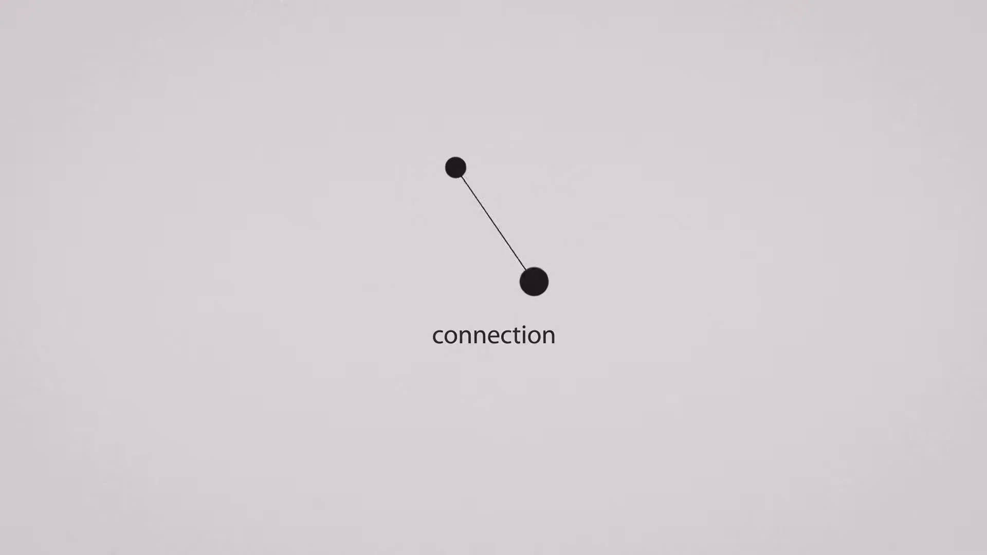
At 0:46, the screen is pale gray. Two prominent black circular dots are connected by a single, straight black line. The graphic is centered on screen, with the word "connection" rendered in black text directly below it. The graphic suggests simplicity and directness.
This moment captures the central treatment by visually simplifying complex ideas into a clear, direct relationship. The 'connection' graphic and text demonstrate the creative solution: reducing noise to find essential relationships, representing intentional design.
At 1:20, the entire screen is a solid black, with a single, small, white circular dot located precisely at the center. The background is completely devoid of any other graphics or text, emphasizing singularity.
This moment connects the narrative promise to the final brand takeaway by visually representing ultimate focus and clarity. The single white dot on a black background foreshadows the iconic Apple logo and embodies the brand's commitment to simplicity, precision, and intention.
Selected frames, transcript, motion, and sound. Source & coverage below.
An approach to borrow.
A creative director or strategist should reference this film structure when aiming to articulate a brand's philosophy through abstract visual metaphors, particularly when the core message revolves around simplifying complexity, achieving focus, or demonstrating intentional design principles without relying on product demonstration or dialogue.
The three inquiry moments connect seamlessly: the 'subject' frame at 0:12 visually captures the overwhelming complexity and rhetorical question of perfection, setting the problem. The 'treatment' frame at 0:46 offers the solution through a clear, simple 'connection' graphic and text. Finally, the 'connection' frame at 1:20 presents the ultimate payoff of 'focus' and simplicity, personified by the single white dot which will become the Apple logo, unifying the design philosophy with the brand.
Study notes & sources
How the film develops
Opening
The opening visually progresses from simple dots to complex, interconnected patterns, posing the question of achieving perfection amidst widespread, unfocused creation, accompanied by ambient, percussive music.
Development
The mid-film develops the theme by showing how 'abundance' can lead to confusion, then introduces the solution of 'connection' and 'intention' through simplifying graphics and text.
Payoff
The closing resolves the narrative by transitioning to a black screen, focusing on a single white dot that morphs into the Apple logo, reinforcing the brand's commitment to 'focus' and intentional design, with the music fading to a contemplative close.
Speech, sound & motion notes
The audio track is purely instrumental music, minimalist and ambient, characterized by a reflective and slightly building tone. Subtle sound effects accompany visual transitions of dots connecting and text appearing, enhancing the visual narrative without any spoken dialogue or voiceover.
Interpretation limits
This Apple film, "Designed by Apple: Intention," uses animated geometric shapes and minimalist text on a white background to articulate Apple's design philosophy, transitioning to a dark background for the final reveal. The creative treatment delivers the message through a visual metaphor of focus and connection amidst complexity, culminating in the Apple logo and brand message. Algorithmic 10fps motion telemetry and 16-bit PCM acoustic metrics measure cut frequency, optical movement, and loudness dynamics, but do not replace human continuous-playback viewing or independent sound-mix listening, nor do they establish commercial ROI or audience conversion outcomes.
Bring your own brief.
Discuss the choices that could serve your project.